
Precious metals and mining stocks have pulled back from their mid-October highs and have been consolidating, and many investors are growing concerned and frustrated as a result, but I want to share an exciting prospect I am watching that may be forming right now. It turns out there is a good chance that, contrary to being a negative development, this period of consolidation is just a brief pause before another surge similar to what we saw in September and early October. If that is indeed the case, we could credibly see gold surge to $5,200 and silver to $72 within the next couple of months, so let’s get started looking at this exciting thesis.
Let’s first look at gold. Now that we are about a month into its consolidation, it appears to be forming a triangle pattern. When this type of pattern develops during a strong rally, it often acts as a continuation pattern, indicating that upon breaking out, gold is likely to make a move similar in size and direction to the one that led into the formation. This presents a very exciting and lucrative opportunity assuming the pattern is confirmed, which I will cover in more detail shortly.
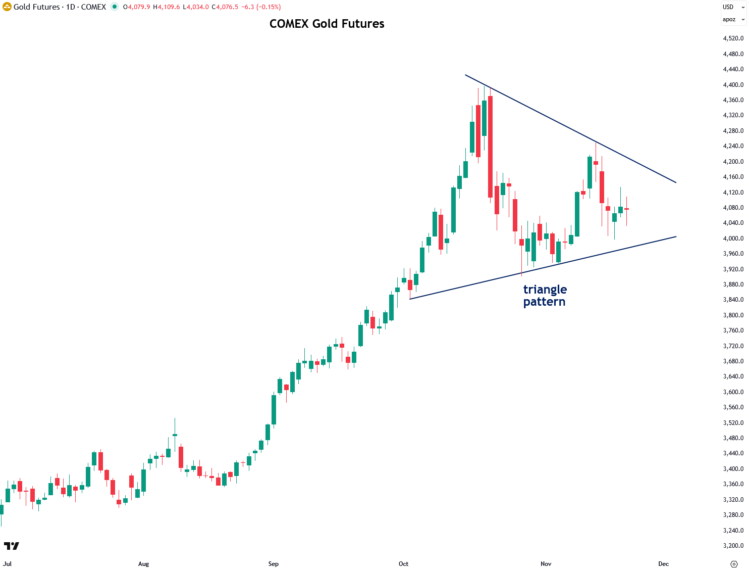
Triangle patterns in gold are nothing new, as we’ve seen over the past year. If the current formation is indeed a triangle, it would be the third such pattern to appear during this period, with the previous two leading to explosive gains. I identified and wrote about both the Winter 2024 and Summer 2025 triangles in this newsletter, and many of my subscribers, along with myself, profited significantly from those moves.
These successes have contributed immensely to the credibility and growth of this newsletter. There is now a strong possibility that another triangle is forming, and if that is the case, it should signal yet another price surge. I certainly hope it does, but confirmation is still needed, as I will discuss next.
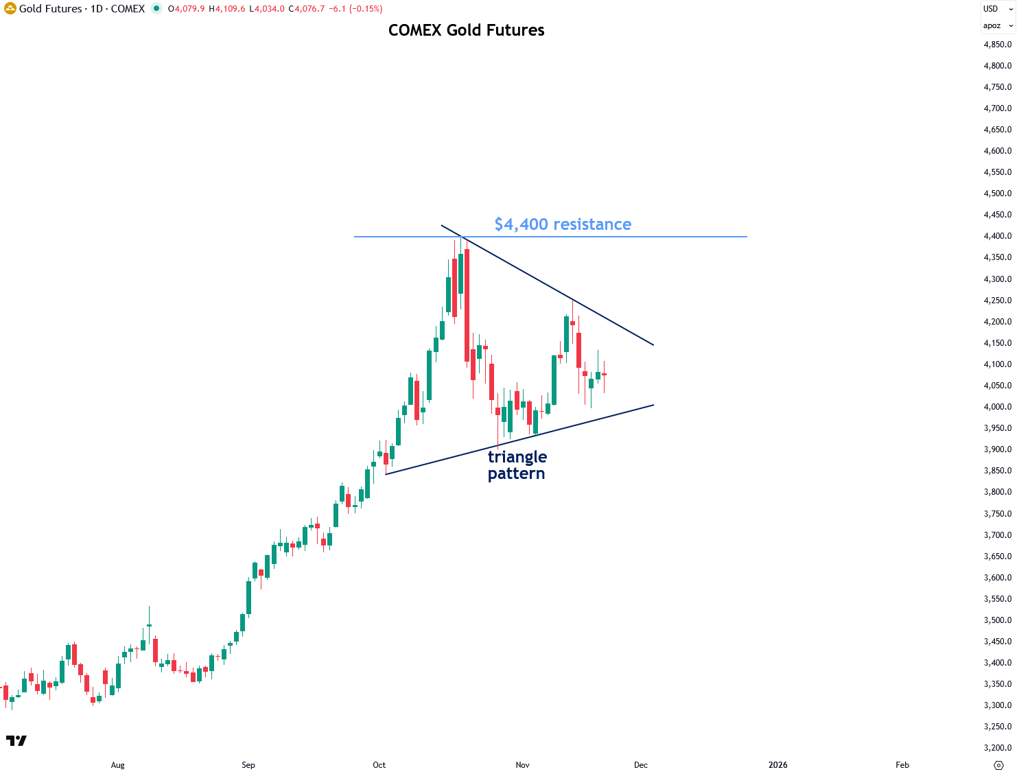
As a technical analyst, I am a big stickler about having confirmation in multiple forms to be extra certain that a move is for real rather than a false breakout. The confirmation I am looking for is, first, a powerful and decisive breakout from the triangle pattern on strong volume, and second, a decisive close above the $4,400 resistance level that formed at the mid-October peak.
The reason I am also holding out for a close above that resistance is that horizontal resistance levels and breakouts above them carry much more weight than breakouts from diagonal resistance levels such as the one on the triangle pattern. It is also worth noting the significance of the $4,400 resistance level, as that is the level I identified all the way back on August 4th as the target for the coming rally, and gold ended up hitting that level on the nose.
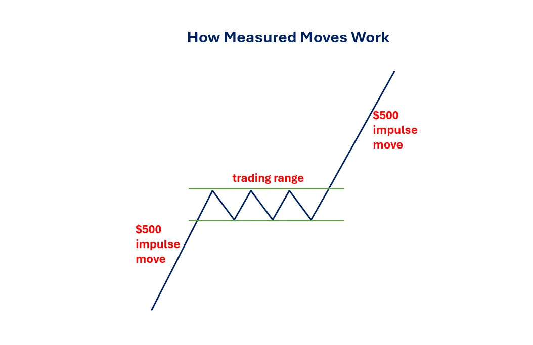
Interestingly, there’s an effective way to estimate how far gold is likely to rally once it breaks out of its current triangle pattern. It involves a principle in technical analysis known as the measured move. This technique projects a potential price target based on the size of the prior move and often proves to be remarkably accurate.
I created the diagram below to illustrate how measured moves work. It begins with an initial impulse move, such as the $500 advance shown in the example. After that surge, the market or asset pauses to consolidate its gains. This consolidation phase can take various forms, such as a sideways trading range or a triangle pattern.
Once the consolidation is complete, the asset breaks out and resumes its rally, typically rising by an amount equal to the initial move. In this case, that would be another $500. It’s a straightforward concept, but a powerful one.
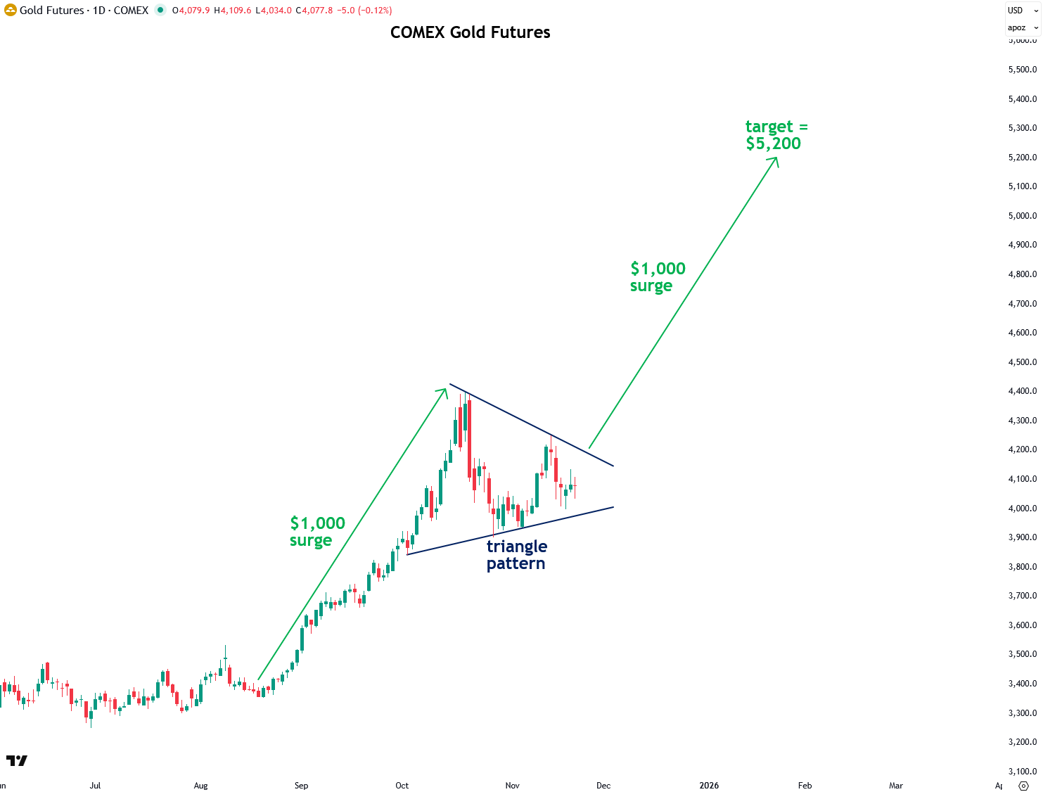
Now let’s take a look at the current triangle pattern forming in gold and estimate, using the measured move principle, how high it is likely to rise once it breaks out. The move leading into the pattern was $1,000, and the projected breakout point based on the triangle is $4,200. By adding the $1,000 move to the breakout point, we get a target of $5,200, which is roughly 28% higher than the current price. Such a move in gold, especially on top of its prior gains this year, would supercharge the overall precious metals and mining sector.
If $5,200 gold sounds unrealistic or overly ambitious, it’s worth noting that this is also completely in line with the projections shared by major banks including Goldman Sachs, Bank of America, HSBC, and Société Générale. In addition, JPMorgan CEO Jamie Dimon, who is not even a precious metals aficionado, recently said that gold “could easily go to $5,000 or $10,000 in environments like this.”
In addition, as I recently explained in a detailed report, gold’s current secular bull market, despite its strong gains over the past couple of years, is still in its early stages and has many years remaining based on comparisons with previous secular bull markets.
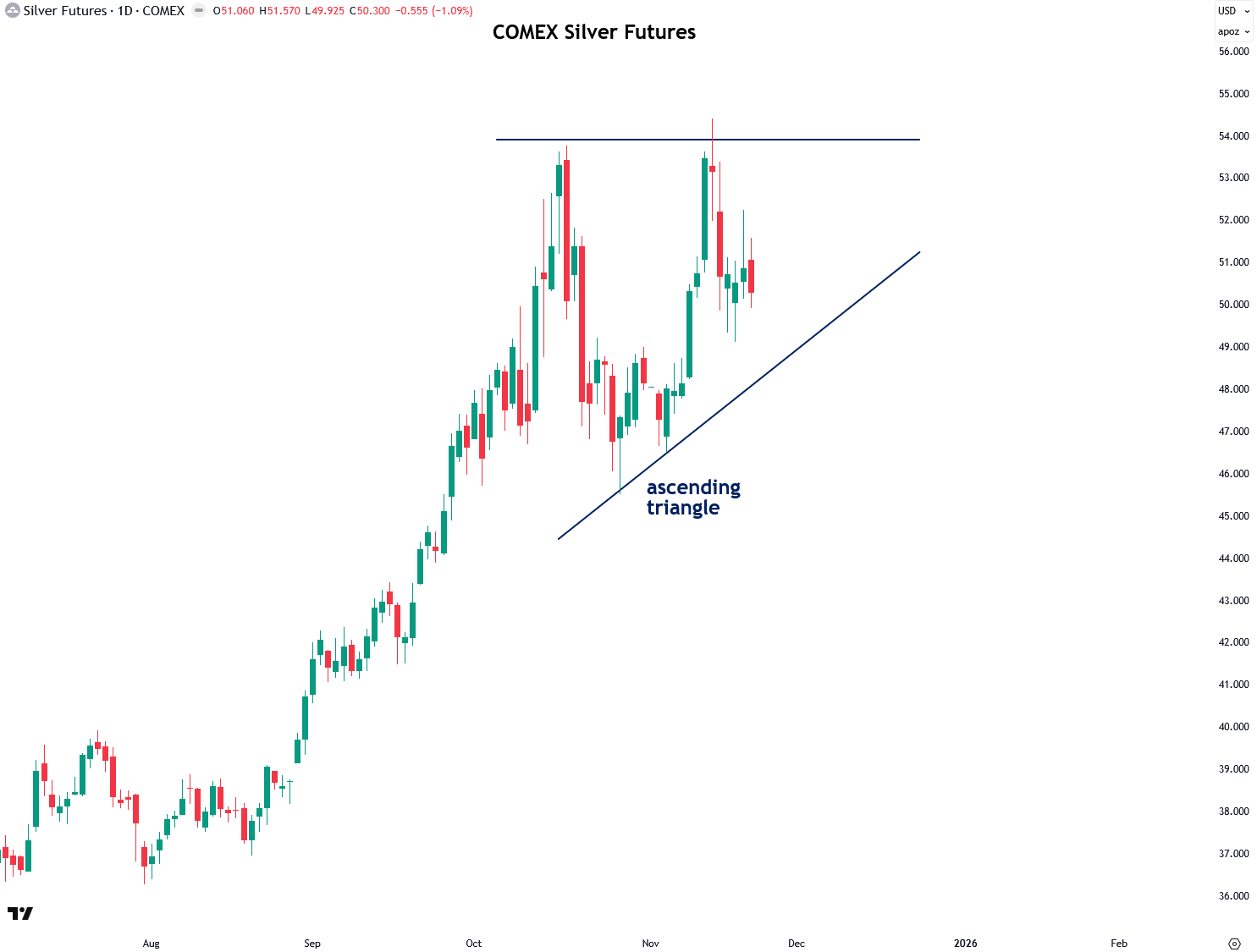
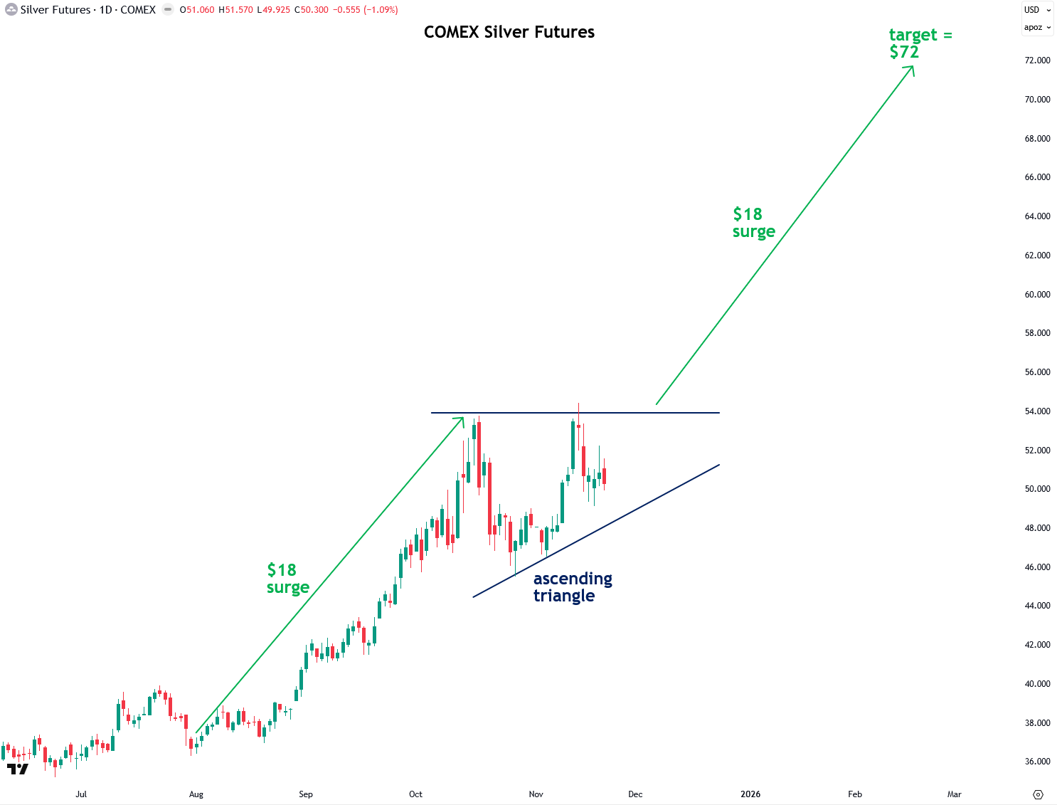
Next, let’s take a look at silver, which is forming a triangle pattern of its own, specifically an ascending triangle. This is not surprising given the close correlation and relationship between gold and silver, and I would expect a breakout in gold to be accompanied by a breakout in silver. The $54 resistance level marks the top of silver’s ascending triangle, so I am looking for a decisive, high-volume close above that level to confirm this thesis.
As with gold, we can estimate how high silver is likely to rise using the measured move principle. The move leading into the triangle was $18 per ounce, and the top of the triangle is at $54. Adding these together gives us a price target of $72, which represents a solid 43% gain from the current level.
That gain is entirely feasible given how undervalued silver is in real terms and compared to its performance in previous secular bull markets, as I explained in recent reports. In addition, if gold rallies to $5,200 in an upcoming breakout, that would support a move in silver to $72 as well.
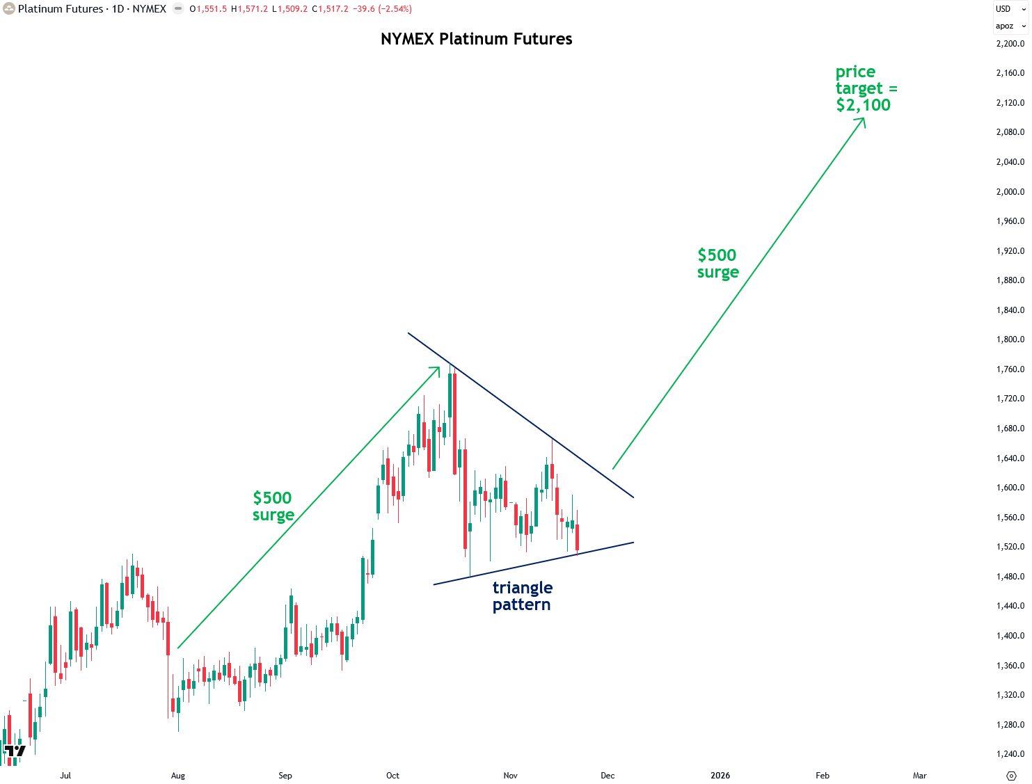
It’s not just gold and silver that are forming triangle patterns, but platinum group metals (PGMs) as well. Here, you can see platinum’s triangle pattern, which points to a target of $2,100 upon breakout, representing a solid 38% gain from the current level.
Read my recent report to learn about the bullish case for platinum.
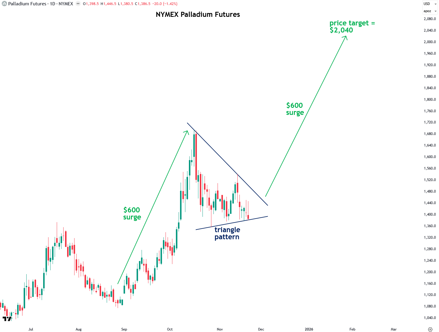
Palladium is also forming its own triangle pattern, which gives a projected price target of $2,040, representing a 47% gain from today’s price.
Read my recent report to learn about the bullish case for palladium.
If precious metals surge, it is reasonable to expect that mining stocks will follow suit, and indeed, triangle patterns are forming in the popular gold and silver ETFs. This scenario also aligns closely with the bullish report on gold and silver miners that I published just a few days ago, which I consider a must-read.
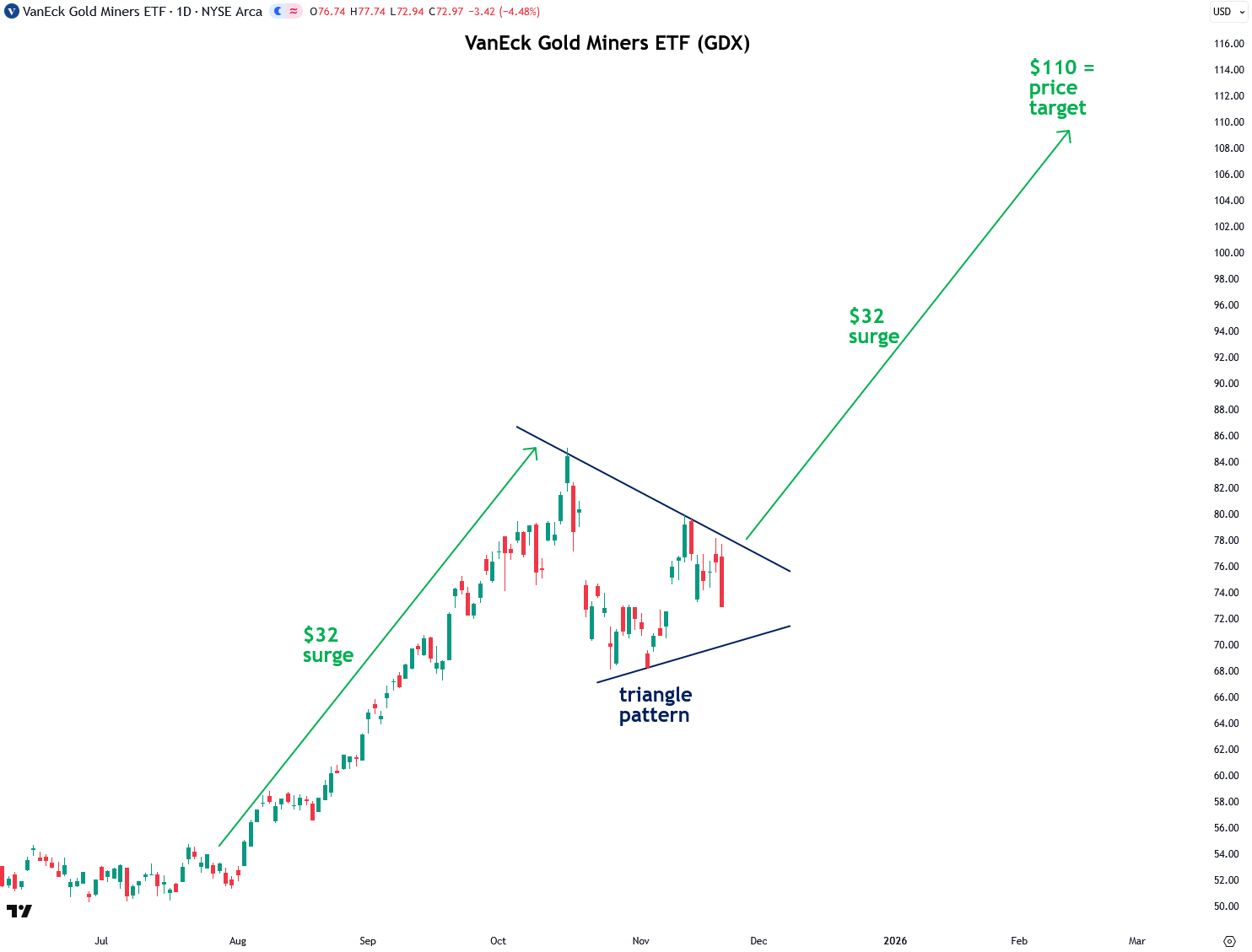
The flagship gold mining stock ETF, GDX, has a price target of $110, which is 51% higher than its current level:
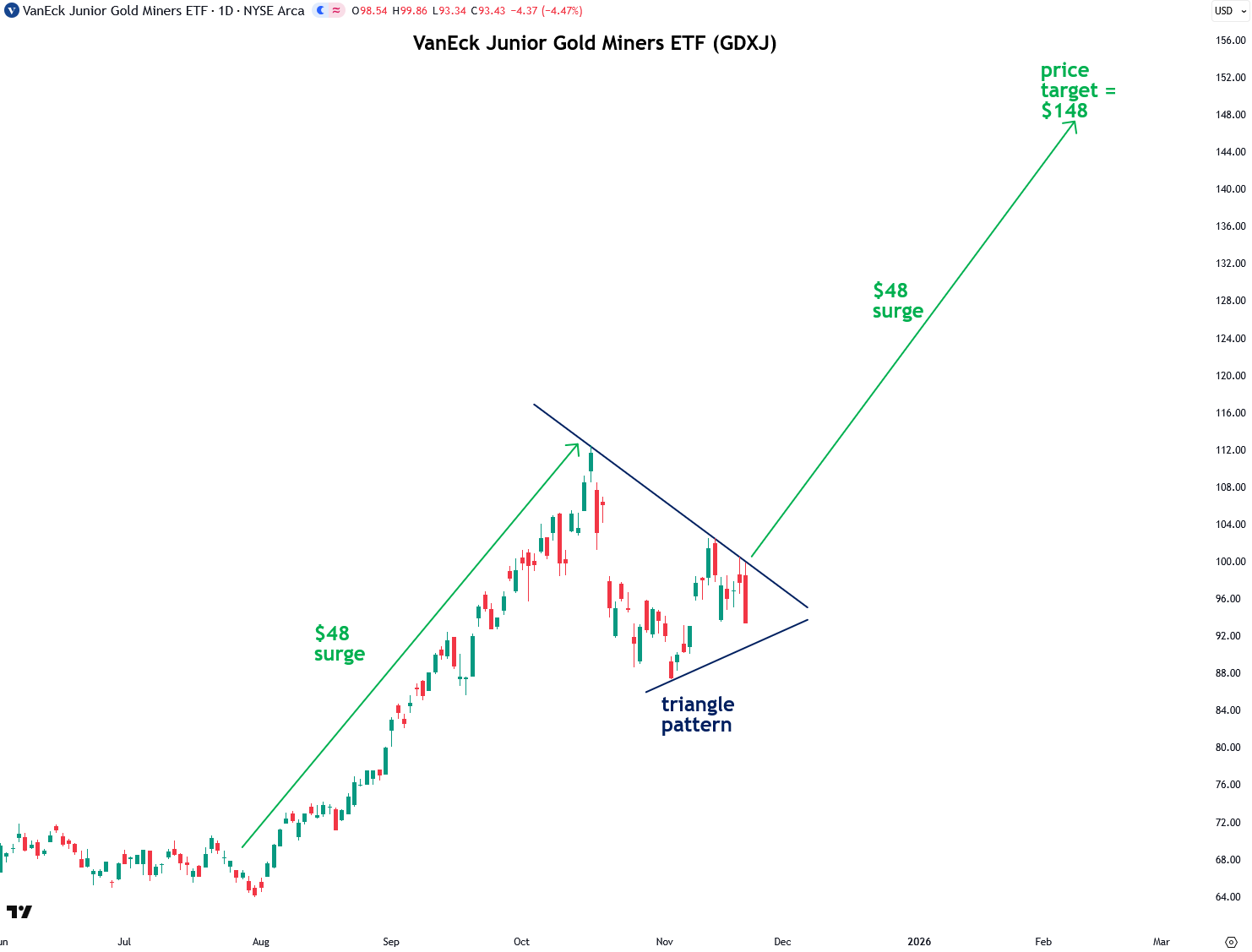
The GDXJ Junior Gold Miners ETF has a price target of $148, representing a 58% gain from its current price:
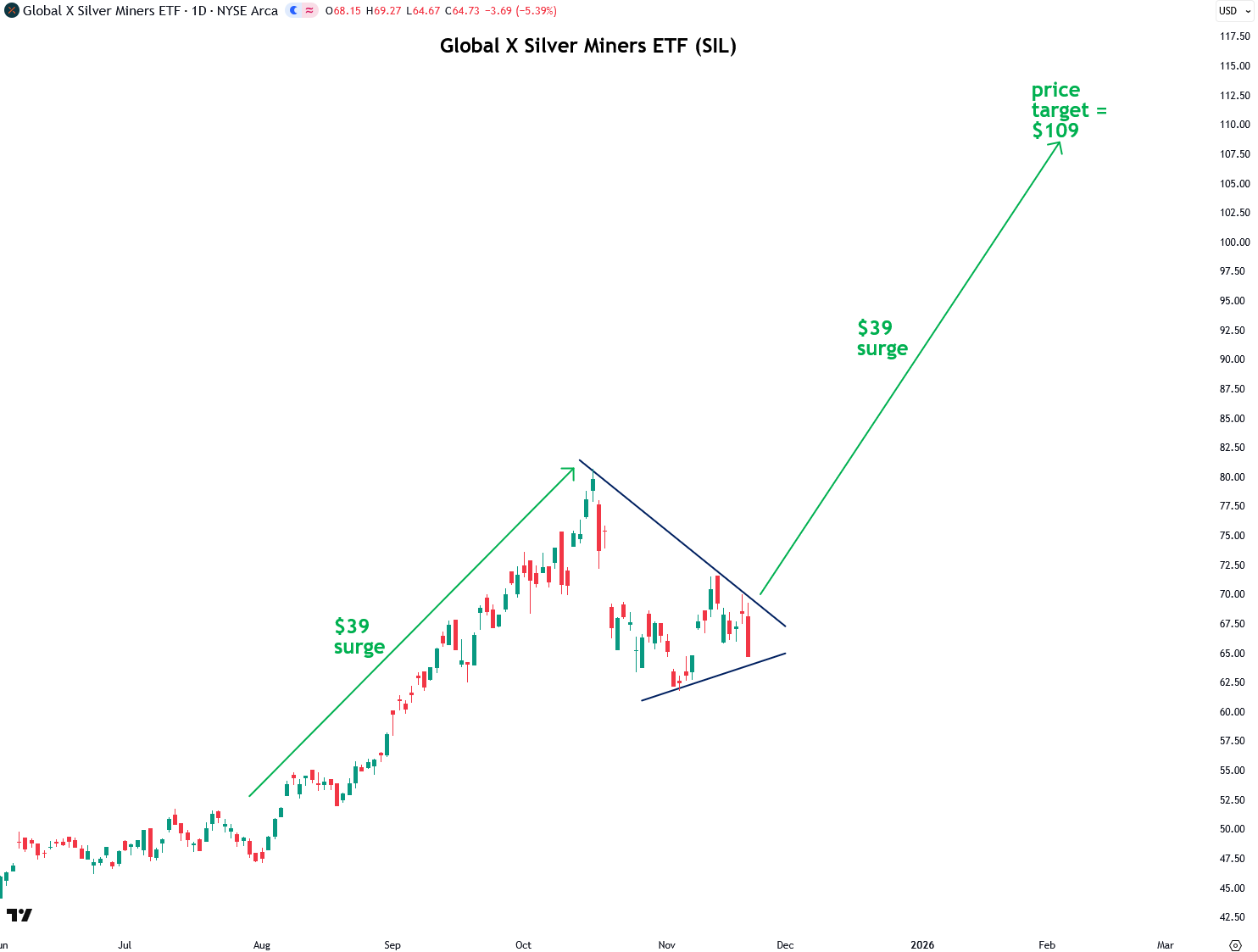
The SIL Silver Miners ETF has a price target of $109, which is 68% higher than its current price:
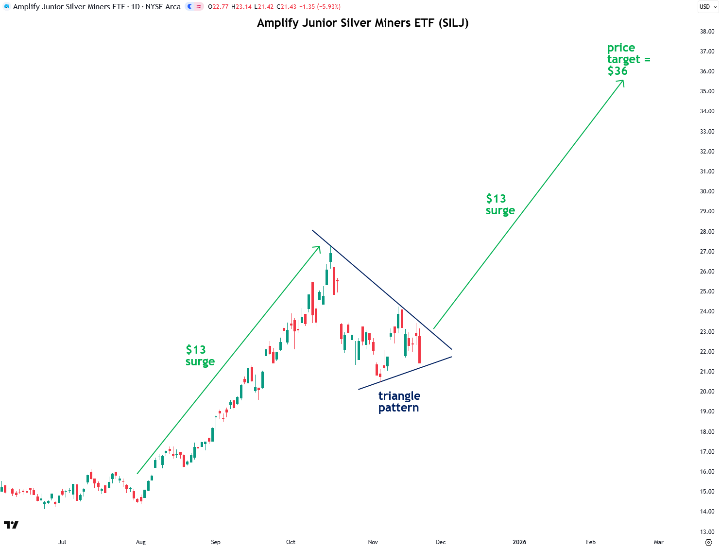
And finally, the SILJ Junior Silver Miners ETF has a price target of $36, which is a 68% gain from the current price:
Now I want to discuss one of the main factors I see driving the next leg of the precious metals bull market higher: the accelerating rotation of capital out of the overvalued and bloated U.S. stock market and into precious metals and mining stocks.
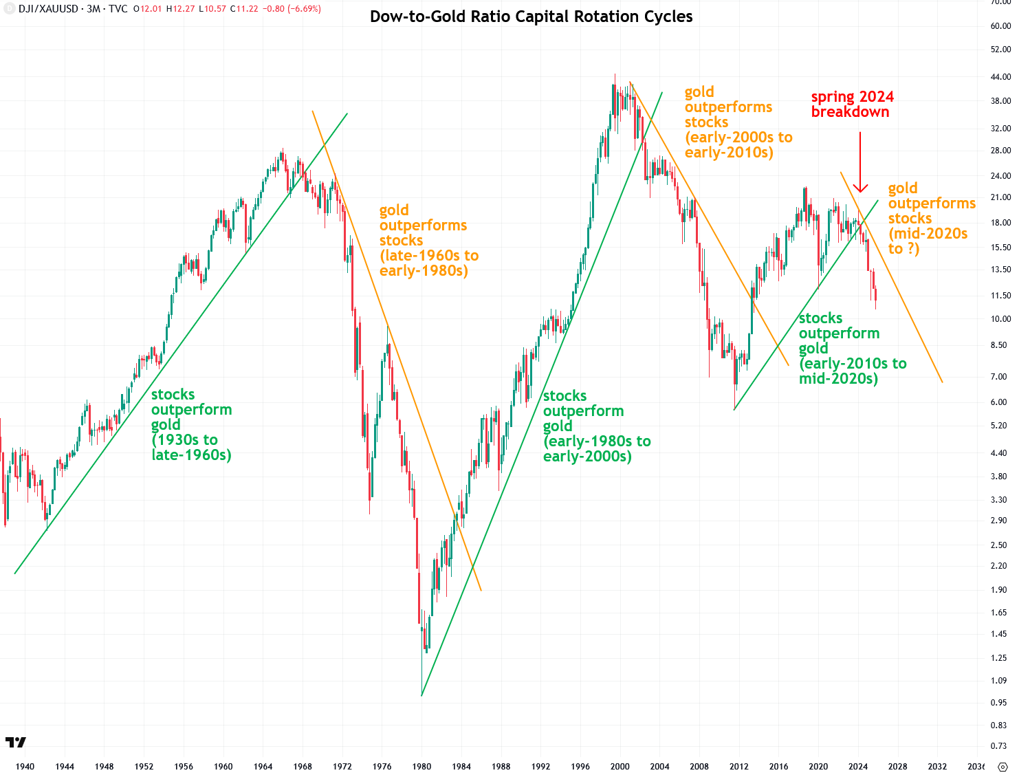
To truly understand capital rotation and the dynamic between stocks and gold, which are essentially competing asset classes, it is helpful to examine the long-term chart of the Dow-to-gold ratio. This ratio is calculated by dividing the Dow Jones Industrial Average (DJIA) by the price of gold. I focus on the Dow because it provides the longest historical data, but the same analysis can be applied to other stock indices, including international ones such as Japan’s Nikkei and the UK’s FTSE 100.
The Dow-to-gold ratio chart I’ve created below spans all the way back to the early 1940s, using 3-month bars and a logarithmic price scale. When the ratio is rising, it indicates that stocks are outperforming gold; when it’s falling, gold is outperforming stocks. This chart is a powerful tool because it respects trendlines remarkably well—so much so that when the ratio breaks a key trendline, it signals the beginning of a new capital rotation era.
Stocks outperformed gold during several major periods: from the 1930s to the late 1960s amid the post–World War II economic boom, during the powerful bull market from 1982 to 2000, and again from 2012 to 2024 following the Great Recession. Conversely, gold outperformed stocks during the stagflationary years of the late 1960s through the early 1980s, and again in the dot-com bust era from the early 2000s to the early 2010s.
Notably, a new era has begun in early 2024, when the Dow-to-gold ratio broke the uptrend line that began in 2012. This breakdown signals a major shift, with a powerful wave of capital flowing out of stocks and into gold, pushing gold much higher from here and lifting silver along with it. It is also important to note that these capital rotation cycles typically last 10 to 15 years. This means we are still in the early innings of a precious metals bull market and at the beginning of a prolonged period of underperformance for stocks.
The rotation of capital out of stocks and into precious metals and miners has much further to go, as the stock market is dangerously overvalued and primed for a mean reversion that will result in a powerful bear market.
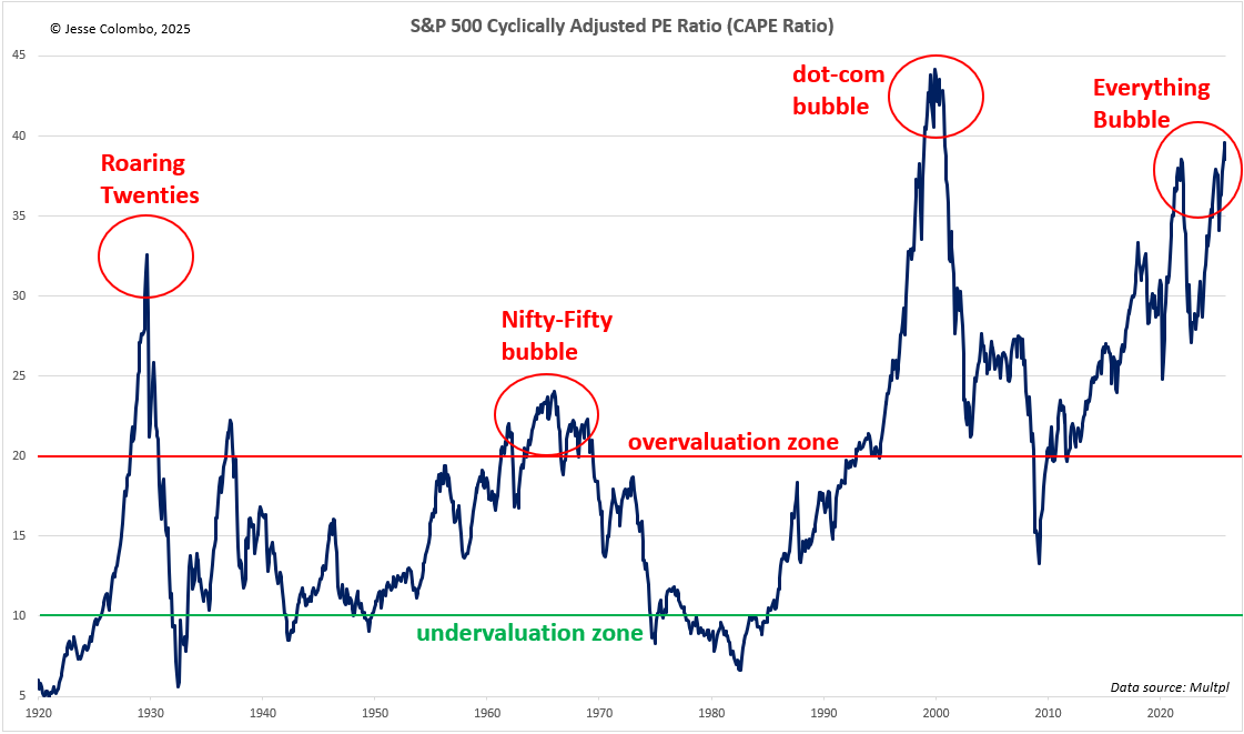
One of the clearest signs of this excessive valuation is the S&P 500’s cyclically adjusted price-to-earnings (CAPE) ratio, which compares the current price of the S&P 500 to its average earnings over the past 10 years. Historically, when this metric reaches extreme levels (20 and higher), sharp market declines soon follow.
As the CAPE chart below shows, the U.S. stock market is currently more overvalued than it was in 1929 before the stock market crash and the Great Depression. That is not a good sign for what lies ahead, at least for the mainstream stock market.
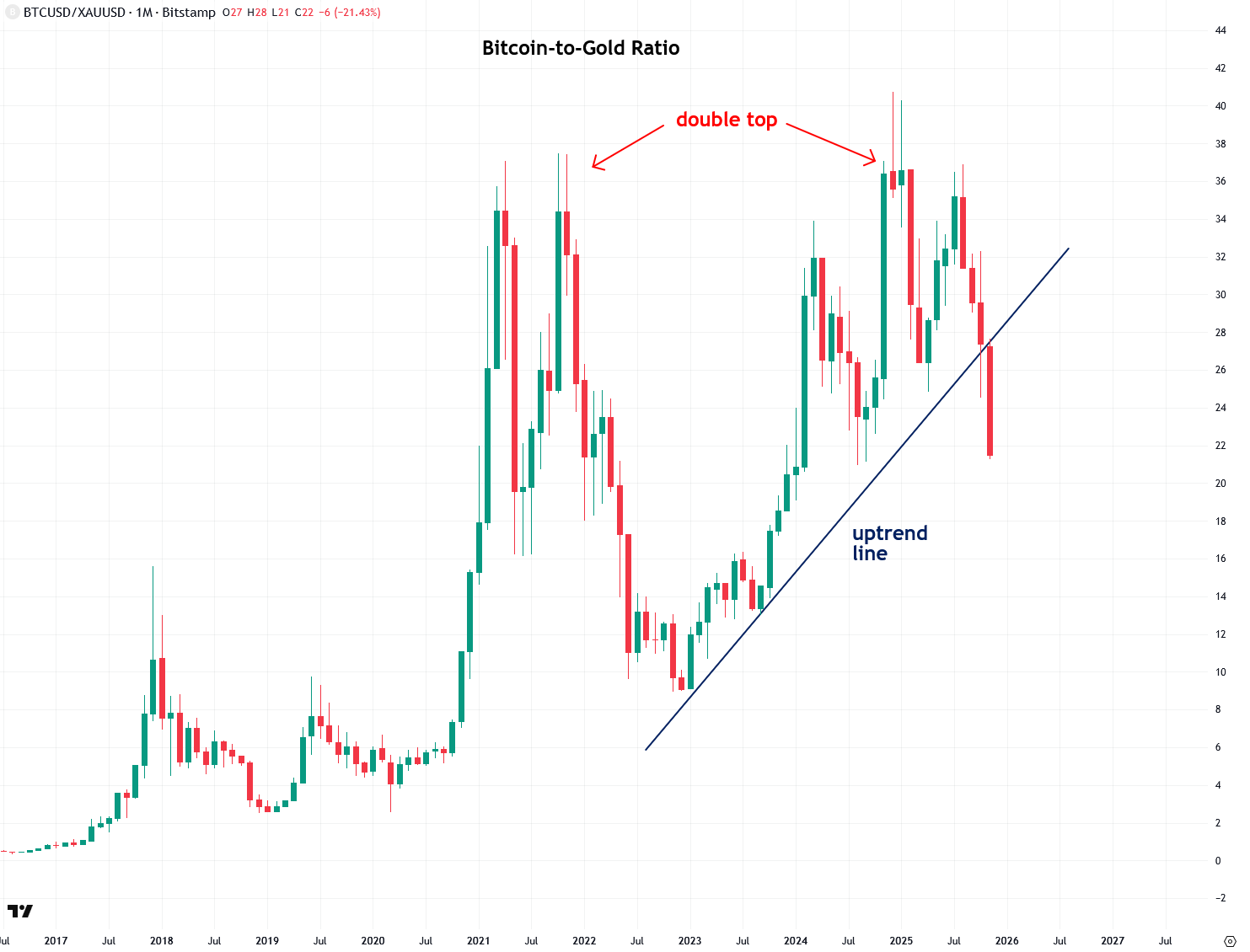
In addition to the accelerating capital rotation from stocks into precious metals, a similar trend is unfolding with Bitcoin and other cryptocurrencies, which have taken a significant hit recently. The chart below shows the Bitcoin-to-gold ratio, which formed a double top pattern between 2021 and 2024 and has now broken below a three-year-old uptrend line.
This indicates that crypto is now underperforming precious metals, signaling the beginning of a flood of capital out of the once‑hyped crypto space and into sound money, which, assuming it continues, would mark a rare return to financial sanity.
To better understand why I am skeptical of Bitcoin and the broader crypto arena, I recommend reading this report.
To summarize, while many investors have been quick to grow frustrated or worried about precious metals and miners following their brief consolidation, as typically happens, the reality is that they may be setting up for another powerful surge similar to what we saw earlier this fall.
If that turns out to be the case, it would be a stellar outcome, and based on the measured move principle, gold is likely to reach $5,200 and silver $72 within just a couple of months. This scenario is not far-fetched, as it aligns with the expectations of several major banks. Of course, this is not a firm prediction on my part until we see clear confirmation, as I explained in this report. Until then, I will continue to keep you updated on what I’m seeing.
In the meantime, I recommend reading the following related reports: